- Component Driven User Interface
- JavaScript
- Svelte
- Vite
- WindiCSS
Yet another workbench?
Atelier (French word for workbench or workshop) is a simple UI component explorer, like angular-playground, storybook, styleguidist, svench or chromatic.
A workbench help you implementing Component Driven Development: crafting reusable UI components in isolation.
Now, about the elephant in the room:
Storybook is a wonderful tool. Do we need a bad clone of it?
In my experience, Storybook does not bring an enjoyable developer experience, mostly because of webpack (as the time of writing).
A lot of people throw a lot of effort to improve it for common cases, leading to powerfull starterkits like create-react-app, and many blogpost (try searching for “storybook + nextjs” 😉).
However, if your project is not react-based, you’re very likely to be forced rewriting an entire webpack configuration, leading to a very fragile and unefficient setup. On medium-sized code base, build time is significant, and becomes a barrier to CDD.
Atelier seamlessly integrates with [Vite] bundler, and give you back control. It has bindings for Svelte, and thanks to Vite’s capabilities, will eventually support Vue and React.
How does it work?
The code is organized in an mono-repository.
-
@atelier-wb/plugin-svelte, is a vite plugin that starts atelier UIIn your
vite.config.jsfile, add:import svelte from "@sveltejs/vite-plugin-svelte"; // other vite plugins import atelier from "@atelier-wb/vite-plugin-svelte"; export default defineConfig({ plugins: [svelte(), /* other plugins */ atelier()], });It will run the Atelier UI (I call it the “frame”) at http://localhost:3000/, and will update it every time you change your components.
-
@atelier-wb/ui, contains the UI frame: a component explorer, and several panels to list triggered event, and tweak component properties. It is built with Svelte, but this does not really matters since users will run a compiled version.It also has an iframe to host the tested component, and control the display size.
-
@atelier-wb/svelte, the Svelte language bindings, which allows users to write “Tools” for their components:<script> import { Tool } from '@atelier-wb/svelte' import MyComponent from '../src/MyComponent.svelte' </script> <Tool name="Components/My component" component={MyComponent} />These bindings will allow the UI tweaking component properties, and listening to its events.
-
@atelier-wb/toolshot, an equivalent of storyshot, that is a collection of snapshots for your components, so you can find structural regressions as part of your Jest test suite.
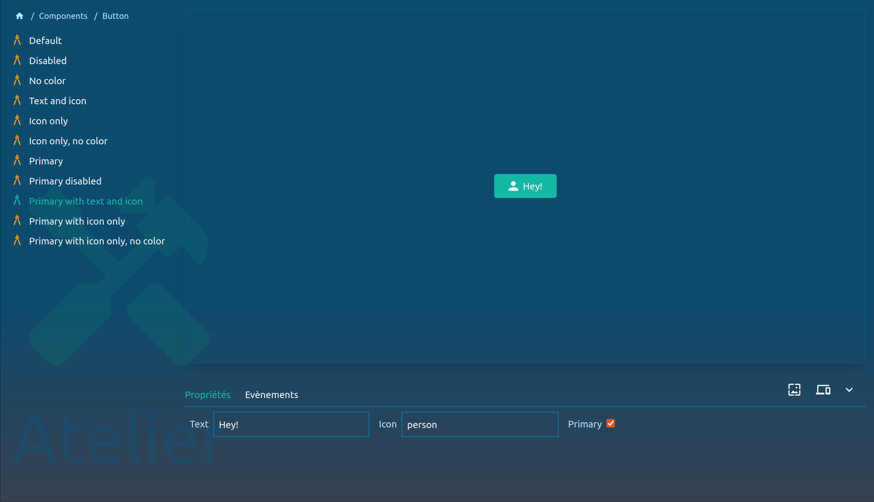
Atelier UI: on the left, a component explorer. At the bottom, tool panels
What’s next?
More documentation, examples, and a couple of features, like React support and a way to filter the explorer.
I would love Atelier to look better, so I need to poke my designer friends for some help 😁